 The D Programming Language's Unofficial Docs
beta
The D Programming Language's Unofficial Docs
beta
The D Programming Language's Unofficial Docs
beta
The D Programming Language's Unofficial Docs
beta
This is your entry point to create your own visual theme for custom widgets.
A line edit box with an associated label.
A labeled password edit.
Convenience import to override the Windows GDI Rectangle function (you can still use it through fully-qualified imports)
Methods marked with this are available from scripts if added to the arsd.script engine.
An Action represents some kind of user action they can trigger through menu options, toolbars, hotkeys, and similar mechanisms. The text label, icon, and handlers are centrally held here instead of repeated in each UI element.
Interface to a custom visual theme which is able to access and use style hint properties, draw stylistic elements, and even completely override existing class' paint methods (though I'd note that can be a lot harder than it may seem due to the various little details of state you need to reflect visually, so that should be your last result!)
Creates a push button with unbounded size. When it is clicked, it emits a triggered event.
Single-value widgets (that is, ones with a programming interface that just expose a value that the user has control over) should emit this after their value changes.
You should generally use a ChangeEvent!Type instead of this directly. See ChangeEvent for more information.
Indicates that a character has been typed by the user. Normally dispatched to the currently focused widget.
A basic checked or not checked box with an attached label.
Indicates that the user has worked with the mouse over your widget. For available properties, see MouseEventBase.
ClosingEvent is fired when a user is attempting to close a window. You can preventDefault to cancel the close.
ClosingEvent is fired when a user is attempting to close a window. You can preventDefault to cancel the close.
A collapsable sidebar is a container that shows if its assigned width is greater than its minimum and otherwise shows as a button.
A combination of free entry with a list below it.
A button with a consistent size, suitable for user commands like OK and CANCEL.
Command Events are used with a widget wants to issue a higher-level, yet loosely coupled command do its parents and other interested listeners, for example, "scroll up".
A CommandEvent is typically actually an instance of these to hold the strongly-typed arguments.
A widget specifically designed to hold other widgets.
The data controller widget is created by reflecting over the given data type. You can use ControlledBy as a UDA on a struct or just let it create things automatically.
A custom widget similar to the HTML5 <details> tag.
A dialog is a transient window that intends to get information from the user before being dismissed.
Indicates that the user has worked with the mouse over your widget. For available properties, see MouseEventBase.
A drop-down list where the user must select one of the given options. Like <select> in HTML.
Contains the implementation of text editing
Represents an event that is currently being processed.
Creates the fieldset (also known as a group box) with the given label. A fieldset is generally used a container for mutually exclusive Radioboxs.
FixedPosition is like StaticPosition, but its coordinates are always relative to the viewport, meaning they do not scroll with the parent content.
FocusInEvent is a FocusEvent that propagates, while FocusOutEvent is a BlurEvent that propagates.
A text box with a drop down arrow listing selections. The user can choose from the list, or type their own.
This is emitted by the TableView when a user clicks on a column header.
Stacks the widgets horizontally, taking all the available height for each child.
Draws a line
Adds empty space to a layout.
Displays an in-progress indicator without known values
Makes all children minimum width and height, placing them down left to right, top to bottom.
Indicates that the user has pressed a key on the keyboard, or if they've been holding it long enough to repeat (key down events are sent both on the initial press then repeated by the OS on its own time.) For available properties, see KeyEventBase.
Contains shared properties for KeyDownEvents and KeyUpEvents.
Indicates that the user has released a key on the keyboard. For available properties, see KeyEventBase.
A list widget contains a list of strings that the user can examine and select.
A MainWindow is a window that includes turnkey support for a menu bar, tool bar, and status bar automatically positioned around a client area where you put your widgets.
You can make one of thse yourself but it is generally easer to use MainWindow.setMenuAndToolbarFromAnnotatedCode.
A MenuItem belongs to a Menu - use Menu.addItem to add one - and calls an Action when it is clicked.
A "mouse activiated widget" is really just an abstract variant of button.
Indicates that the user has worked with the mouse over your widget. For available properties, see MouseEventBase.
Contains shared properties for various mouse events;
Indicates that the user has worked with the mouse over your widget. For available properties, see MouseEventBase.
A mouse tracking widget is one that follows the mouse when dragged inside it.
Indicates that the user has worked with the mouse over your widget. For available properties, see MouseEventBase.
A helper to make widgets out of other native windows.
Nests an opengl capable window inside this window as a widget.
A page widget is basically a tab widget with hidden tabs. It is also sometimes called a "StackWidget".
A LineEdit that displays * in place of the actual characters.
A progress bar with a known endpoint and completion amount
Creates a radio button with an associated label. These are usually put inside a Fieldset.
A widget that takes your widget, puts scroll bars around it, and sends messages to it when the user scrolls. Unlike ScrollableWidget, it makes no effort to automatically scroll or clip its child widgets - it just sends the messages.
A widget meant to contain other widgets that may need to scroll.
A widget that tries (with, at best, limited success) to offer scrolling that is transparent to the inner.
A slider, also known as a trackbar control, is commonly used in applications like volume controls where you want the user to select a value between a min and a max without needing a specific value or otherwise precise input.
Event fired when an Observeable variable changes. You will want to add an event listener referencing the field like widget.addEventListener((scope StateChanged!(Whatever.field) ev) { });
Bypasses automatic layout for its children, using manual positioning and sizing only. While you need to manually position them, you must ensure they are inside the StaticLayout's bounding box to avoid undefined behavior.
Bypasses automatic positioning when being laid out. It is your responsibility to make room for this widget in the parent layout.
Status bars appear at the bottom of a MainWindow. They are made out of Parts, with a width and content.
A tab widget is a set of clickable tab buttons followed by a content area.
A TableView is a widget made to display a table of data strings.
A read-only text display
Toolbars are lists of buttons (typically icons) that appear under the menu. Each button ought to correspond to a menu item, represented by Action objects.
Stacks the widgets vertically, taking all the available width for each child.
Draws a line
Adds empty space to a layout.
This is your entry point to create your own visual theme for custom widgets.
The Widget is the base class for minigui's functionality, ranging from UI components like checkboxes or text displays to abstract groupings of other widgets like a layout container or a html <div>. You will likely want to use pre-made widgets as well as creating your own.
EXPERIMENTAL
The purpose of this enum was to give a compile-time checked version of various standard event strings.
Identifies the button the user pressed on a message box.
For ScrollableWidget, determines when to show the scroll bar to the user.
User-defined attribute you can add to struct members contrlled by addDataControllerWidget or dialog to tell which widget you want created for them.
Intended for UFCS action like window.addDataControllerWidget(new MyObject());
Intended for UFCS action like window.addDataControllerWidget(new MyObject());
Convenience function to add a triggered event listener.
Declares that the given widget consumes a command identified by the CommandString AND containing Args. Your handler is called with the arguments, then the event's propagation is stopped, so it will not be seen by the consumer's parents.
Calls MS Windows' CreateWindowExW function to create a native backing for the given widget. It will create needed mappings, window procedure hooks, and other private member variables needed to tie it into the rest of minigui's expectations.
Creates a dialog based on a data structure.
Emits a command to the sender widget's parents with the given CommandString and args. You have no way of knowing if it was ever actually consumed due to the loose coupling. Instead, the consumer may broadcast a state update back toward you.
Gets a file name for an open or save operation, calling your onOK function when the user has selected one. This function may or may not block depending on the operating system, you MUST assume it will complete asynchronously.
Displays a modal message box, blocking until the user dismisses it.
Observes and allows inspection of an object via automatic gui
This is your entry point to create your own visual theme for custom widgets.
This lets you statically verify you send the events you claim you send and gives you a hook to document them.
Convenience mixin for overriding all four sides of margin or padding in a Widget with the same code. It mixes in the given string as the return value of the four overridden methods.
Observable varables can be added to widgets and when they are changed, it fires off a StateChanged event so you can react to it.
Convenience mixin for overriding all four sides of margin or padding in a Widget with the same code. It mixes in the given string as the return value of the four overridden methods.
Implementation detail of the ControlledBy UDA.
This is an opaque type you can use to disconnect an event handler when you're no longer interested.
Used in automatic menu functions to indicate that the user should be able to browse for a file.
Get this through Widget.getComputedStyle. It provides access to the Widget.Style style hints and Widget layout hints, possibly modified through the VisualTheme, through a unifed interface.
Structure to represent a collection of background hints. New features can be added here, so make sure you use the provided constructors and factories for maximum compatibility.
Encapsulates the simpledisplay ScreenPainter for use on a Widget, with VisualTheme and invalidated area awareness.
Program-wide keyboard shortcut to trigger the action
Group: generating_from_code
Group: generating_from_code
Group: generating_from_code
tells which menu the action will be on
This item in the menu will be preceded by a separator line
Group: generating_from_code
Describes which toolbar section the action appears on
This is a helper for addDataControllerWidget. You can use it as a UDA on the type. See http://dpldocs.info/this-week-in-d/Blog.Posted_2020_11_02.html for more information.
minigui's only required dependencies are arsd.simpledisplay and arsd.color, on which it is built. simpledisplay provides the low-level interfaces and minigui builds the concept of widgets inside the windows on top of it.
Its #1 goal is to be useful without being large and complicated like GTK and Qt. It isn't hugely concerned with appearance - on Windows, it just uses the native controls and native theme, and on Linux, it keeps it simple and I may change that at any time, though after May 2021, you can customize some things with css-inspired Widget.Style classes. (On Windows, if you compile with -version=custom_widgets, you can use the custom implementation there too, but... you shouldn't.)
The event model is similar to what you use in the browser with Javascript and the layout engine tries to automatically fit things in, similar to a css flexbox.
FOR BEST RESULTS: be sure to link with the appropriate subsystem command -L/SUBSYSTEM:WINDOWS:5.0, for example, because otherwise you'll get a console and other visual bugs.
| HTML Code | Minigui Class |
|---|---|
| <input type="text"> | LineEdit |
| <textarea> | TextEdit |
| <select> | DropDownSelection |
| <input type="checkbox"> | Checkbox |
| <input type="radio"> | Radiobox |
| <button> | Button |
Stretchiness: The default is 4. You can use larger numbers for things that should consume a lot of space, and lower numbers for ones that are better at smaller sizes.
COMING EVENTUALLY: minigui will include a little bit of I/O functionality that just works with the event loop. If you want to get fancy, I suggest spinning up another thread and posting events back and forth.
See the minigui_addons directory in the arsd repo for some add on widgets you can import separately too.
If you use arsd.minigui_xml, you can create widget trees from XML at runtime.
minigui is compatible with arsd.script. If you see @scriptable on a method in this documentation, it means you can call it from the script language.
Tip: to allow easy creation of widget trees from script, import arsd.minigui_xml and make arsd.minigui_xml.makeWidgetFromString available to your script:
import arsd.minigui_xml;
import arsd.script;

var globals = var.emptyObject;
globals.makeWidgetFromString = &makeWidgetFromString;

// this now works
interpret(`var window = makeWidgetFromString("<MainWindow />");`, globals);
More to come.
This hello world sample will have an oversized button, but that's ok, you see your first window!
import arsd.minigui;

void main() {
	auto window = new MainWindow();

	// note the parent widget is almost always passed as the last argument to a constructor
	auto hello = new TextLabel("Hello, world!", TextAlignment.Center, window);
	auto button = new Button("Close", window);
	button.addWhenTriggered({
		window.close();
	});

	window.loop();
}
This example shows one way you can partition your window into a header and sidebar. Here, the header and sidebar have a fixed width, while the rest of the content sizes with the window.
It might be a new way of thinking about window layout to do things this way - perhaps GridLayout more matches your style of thought - but the concept here is to partition the window into sub-boxes with a particular size, then partition those boxes into further boxes.
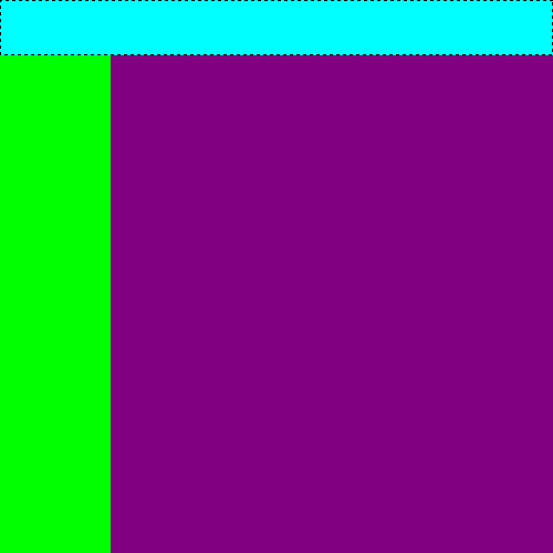
So to make the header, start with a child layout that has a max height. It will use that space from the top, then the remaining children will split the remaining area, meaning you can think of is as just being another box you can split again. Keep splitting until you have the look you desire.
import arsd.minigui;

// This helper class is just to help make the layout boxes visible.
// think of it like a <div style="background-color: whatever;"></div> in HTML.
class ColorWidget : Widget {
	this(Color color, Widget parent) {
		this.color = color;
		super(parent);
	}
	Color color;
	class Style : Widget.Style {
		override WidgetBackground background() { return WidgetBackground(color); }
	}
	mixin OverrideStyle!Style;
}

void main() {
	auto window = new Window;

	// the key is to give it a max height. This is one way to do it:
	auto header = new class HorizontalLayout {
		this() { super(window); }
		override int maxHeight() { return 50; }
	};
	// this next line is a shortcut way of doing it too, but it only works
	// for HorizontalLayout and VerticalLayout, and is less explicit, so it
	// is good to know how to make a new class like above anyway.
	// auto header = new HorizontalLayout(50, window);

	auto bar = new HorizontalLayout(window);

	// or since this is so common, VerticalLayout and HorizontalLayout both
	// can just take an argument in their constructor for max width/height respectively

	// (could have tone this above too, but I wanted to demo both techniques)
	auto left = new VerticalLayout(100, bar);

	// and this is the main section's container. A plain Widget instance is good enough here.
	auto container = new Widget(bar);

	// and these just add color to the containers we made above for the screenshot.
	// in a real application, you can just add your actual controls instead of these.
	auto headerColorBox = new ColorWidget(Color.teal, header);
	auto leftColorBox = new ColorWidget(Color.green, left);
	auto rightColorBox = new ColorWidget(Color.purple, container);

	window.loop();
}
Minigui had mostly additive changes or bug fixes since its inception until May 2021.
In May 2021 (dub v10.0), minigui got an overhaul. If it was versioned independently, I'd tag this as version 2.0.
Among the changes:
See Event for details.
See DoubleClickEvent for details.
See Widget.Style for details.
// * A widget must now opt in to receiving keyboard focus, rather than opting out.
minigui is a smallish GUI widget library, aiming to be on par with at least HTML4 forms and a few other expected gui components. It uses native controls on Windows and does its own thing on Linux (Mac is not currently supported but may be later, and should use native controls) to keep size down. The Linux appearance is similar to Windows 95 and avoids using images to maintain network efficiency on remote X connections, though you can customize that.